

What's In My Marker Box?✍️🌈
Making a personal color palette of alcohol markers

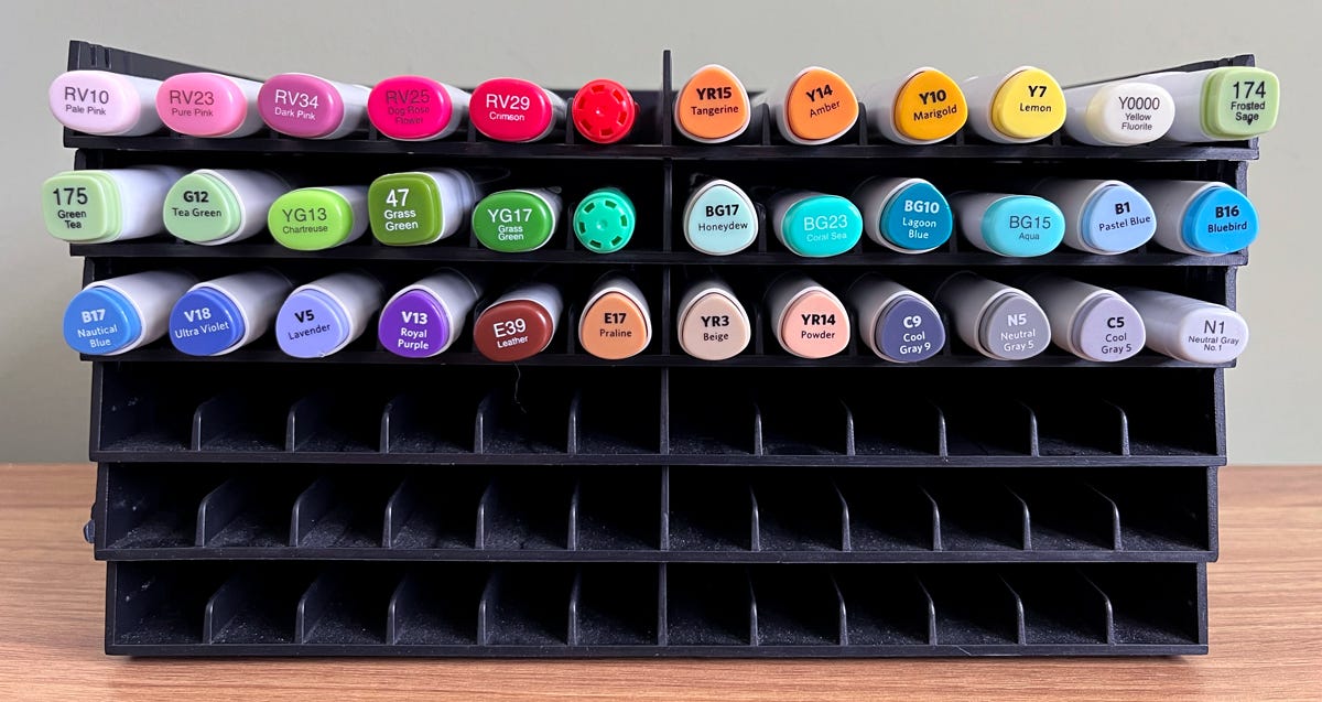
Last week, when I bought a few new alcohol markers, I got to thinking—it’s hard to see and remember what marker colors I have! Sure, I’ve got them lined up in one of those silly marker holders, but it’s still unclear what I’ve got to work with. Am I missing a big chunk of the rainbow? Are those caps actually indicative of how the ink looks on paper?
And then, I found this lovely color chart by Artist’s Loft:
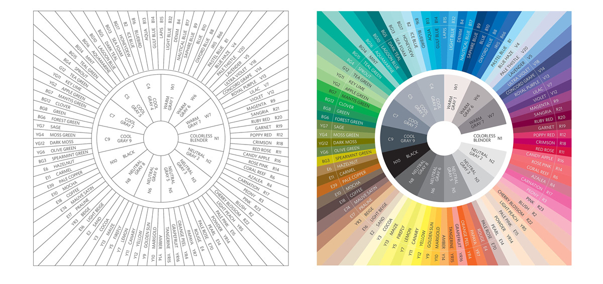
So of course, I immediately printed one out and colored it in with all my markers. I included both the Artist’s Loft brand and whatever other brands I had (those are designated by blue pen). And it was actually a really interesting exercise!
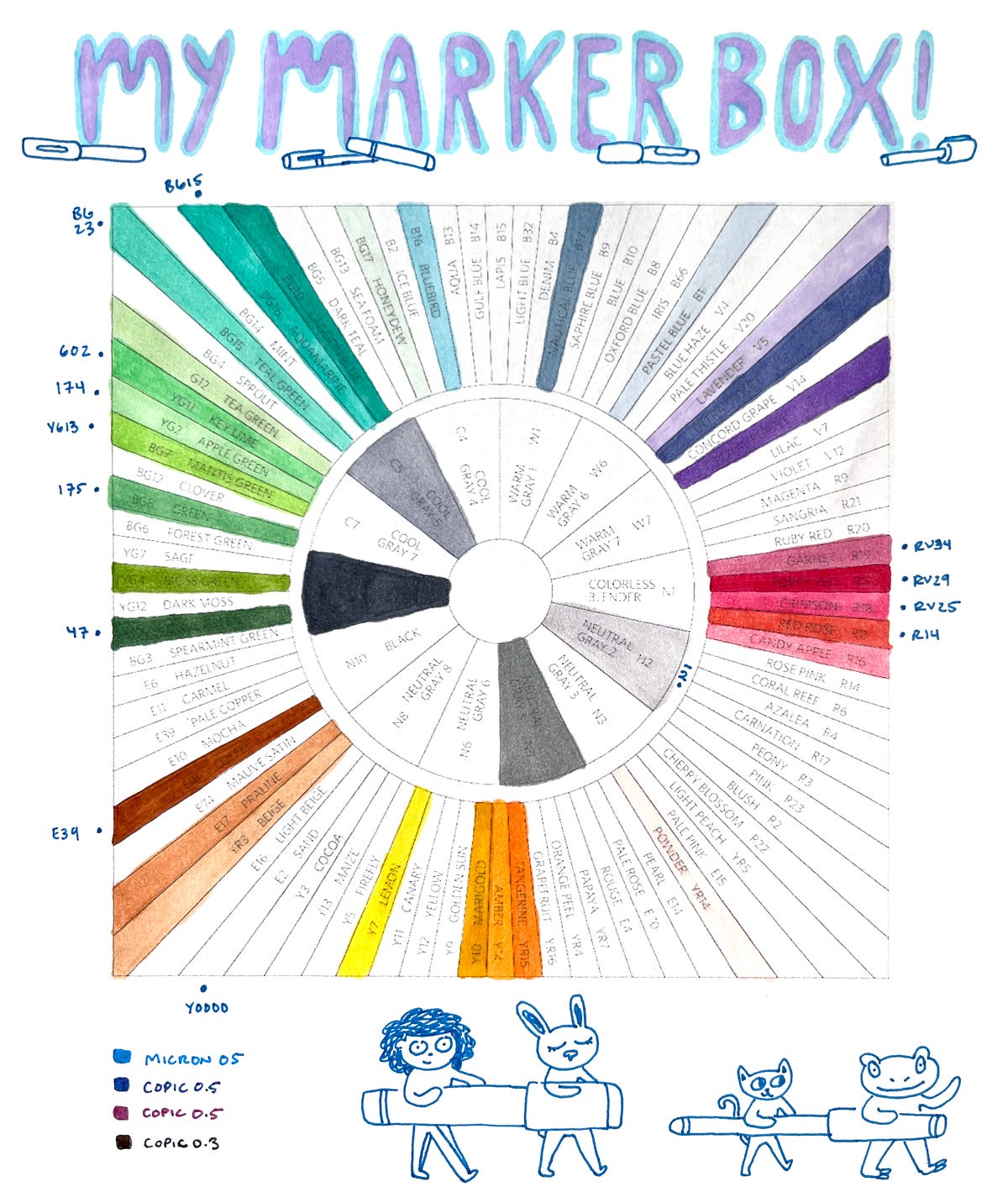
It showed me where I was indeed missing some spots of the rainbow, specifically pale pinks, yellows, and blues. The blues I can account for: a couple of my blue Copic markers dried out recently and I had to throw them out.
But the balance of colors I have (and therefore the balance of colors I use in my drawings) is interesting. I don’t have hardly any pale pinks. I have quite a few turqouises, and I have plenty of greens. How funny! When people (aka kids) ask what my favorite color is, I usually say turquoise or green. And that’s subconsciously showing through in my color choices! Interesting.
Once I finished marking all my colors and seeing which were left blank, I felt the strong temptation to collect them all just like my Pokemon days of the early 2000’s. I suppose there’s some innate desire in humans to complete a collection, to own every piece. But not only would it be extremely expensive to buy every color available, it’s also not the best method for making art.
I don’t need every color to create a piece of cool art. Minimal color palettes (in my opinion) are more enticing and beautiful than palettes that include every color of the rainbow. Not having every color to work with leads to interesting constraints that force creative solutions.
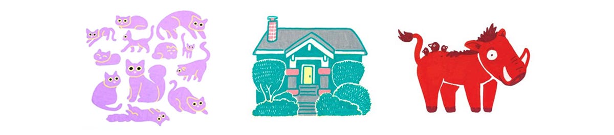
For example, if you’re drawing a raccoon but don’t have shades of gray to draw with, perhaps you draw the raccoon in shades of blue instead. Wouldn’t that be just as good… or maybe even better?
So anyways, while I enjoyed plotting out my marker box and visualizing what’s in there, I’m gonna sit on what I have for a while before getting any new markers. I’ll work with what I’ve got and see what comes of it!
Thanks for reading!
<3,
Christine
P.S. Have you ever made a chart of the colors of any of your art materials? What did you think about it?
Very interesting. I know I have strong color biases as well. And I do feel a bit hampered sometimes by what I have on hand. I will consider that suggestion to go with unconventional color choices!
What fun! I don’t use materials bought individually, apart from good quality ‘gel pens’? which only come in certain colours anyway, although I guess I do have a few oddment pastel pencils for shading rather than pulling out the whole set of pastel pencils. Hmmm…. Lots of food for thought.
Funny to see all those greens! I hadn’t quite realised how much variety there can be in that part of the spectrum, even though I often try capturing native greenery (rainforests, etc) so am aware of the range there…