


33. A Turquoise Jelly! (Final Art: Spread 6-7)
We Are Jellyfish: Picture Book Process

Hey y’all,
I’m not oblivious to the way I use the word “final”, you know. Ever since I shared the Final storyboard (which is not final), I’ve been sharing “Final Art Spreads” (which are also not final). I like saying final because it makes me feel like I’m making progress and, however meanderingly, moving in the right direction. Often, the road to finishing a book is not just long and twisty but also wanders in every direction. Sometimes I feel like I’m pushing things forward and sometimes I feel like I’m falling backwards. Making mistakes, trying things that don’t end up working, or just making something that looks… bad. It happens! Often!
In times like those, the reminder that I’m working on the final art, helps. So why not? I’ll take all the help I can get.
Anyways, onto today’s FINAL art! Here’s the process I went through this week creating the final art for spread 6-7. (Nope, I won’t stop calling it final—I AM making progress on this book, even if it takes me 3 years to finish it!)
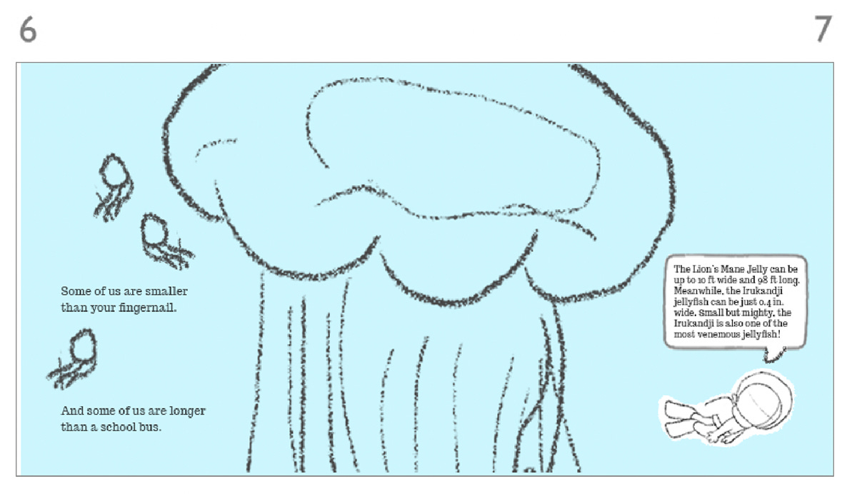
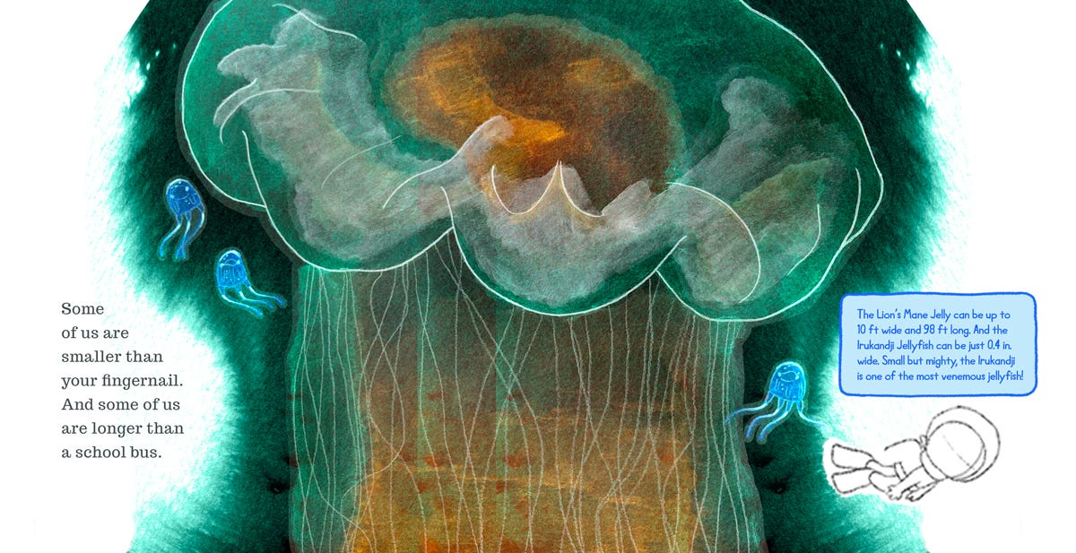
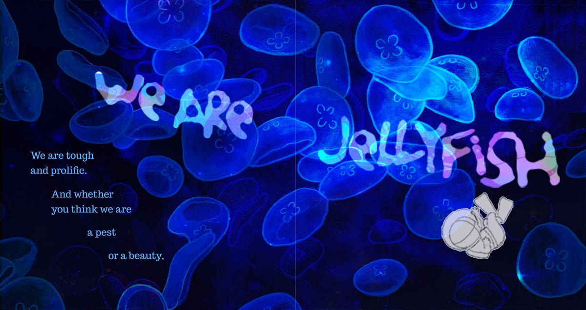
Ok, now that that’s off my chest! First, I took the sketch for spread 6-7 from my storyboard and blew it up to full size (17.5 in x 9 in at 300dpi).
Then I thought about how I wanted to incorporate the wet-watercolor-on-white background idea that I stumbled on last week. Above, I played with the composition and typography until I had all the pieces fitting together well. I’m pretty happy with how I was able to mimic the undulating feel of jellyfish in the background and typography.
I also updated the science note into the final color/typography and added a little jellyfish tentacle reaching out to the scuba diver girl, because it creepily alludes to what’s gonna happen later in the book!
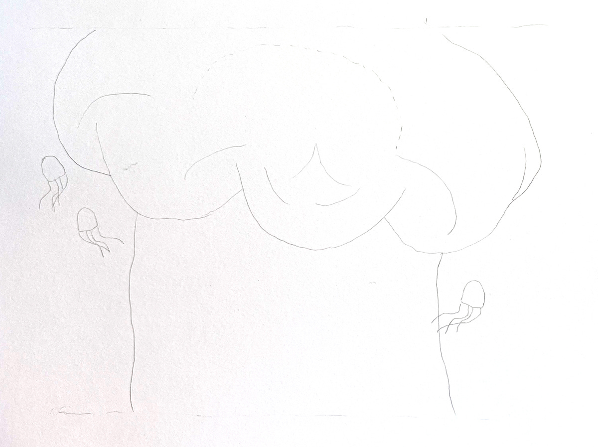
Next, I drew the overall shape of the jellyfish sketch onto a piece of watercolor paper.
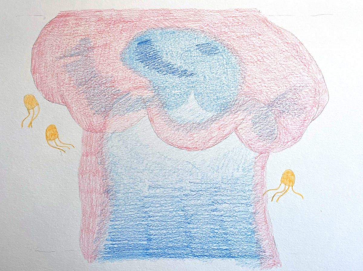
Then I colored it in with my Staedtler Watercolor Pencils using the opposite colors of what I wanted it to be (pink becomes green, blue becomes orange, etc.)
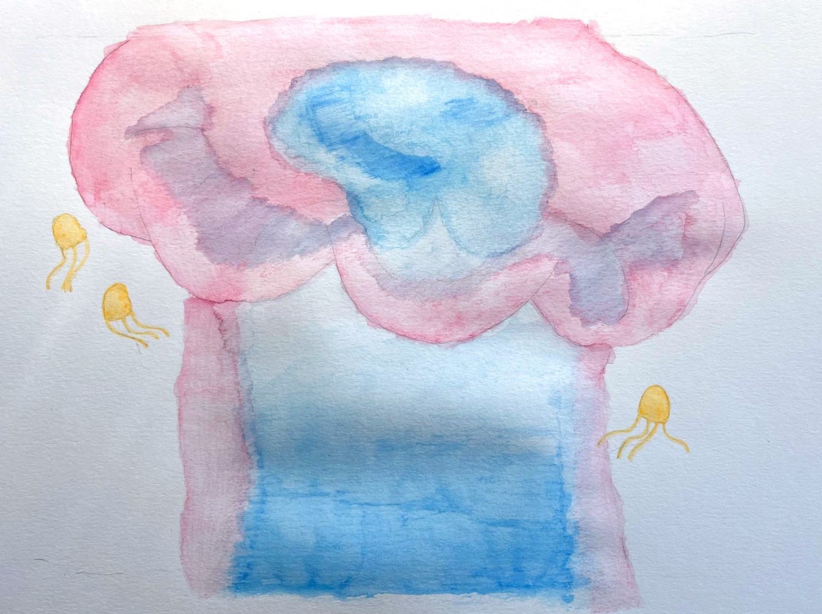
Then I activated the colors by painting it with water!
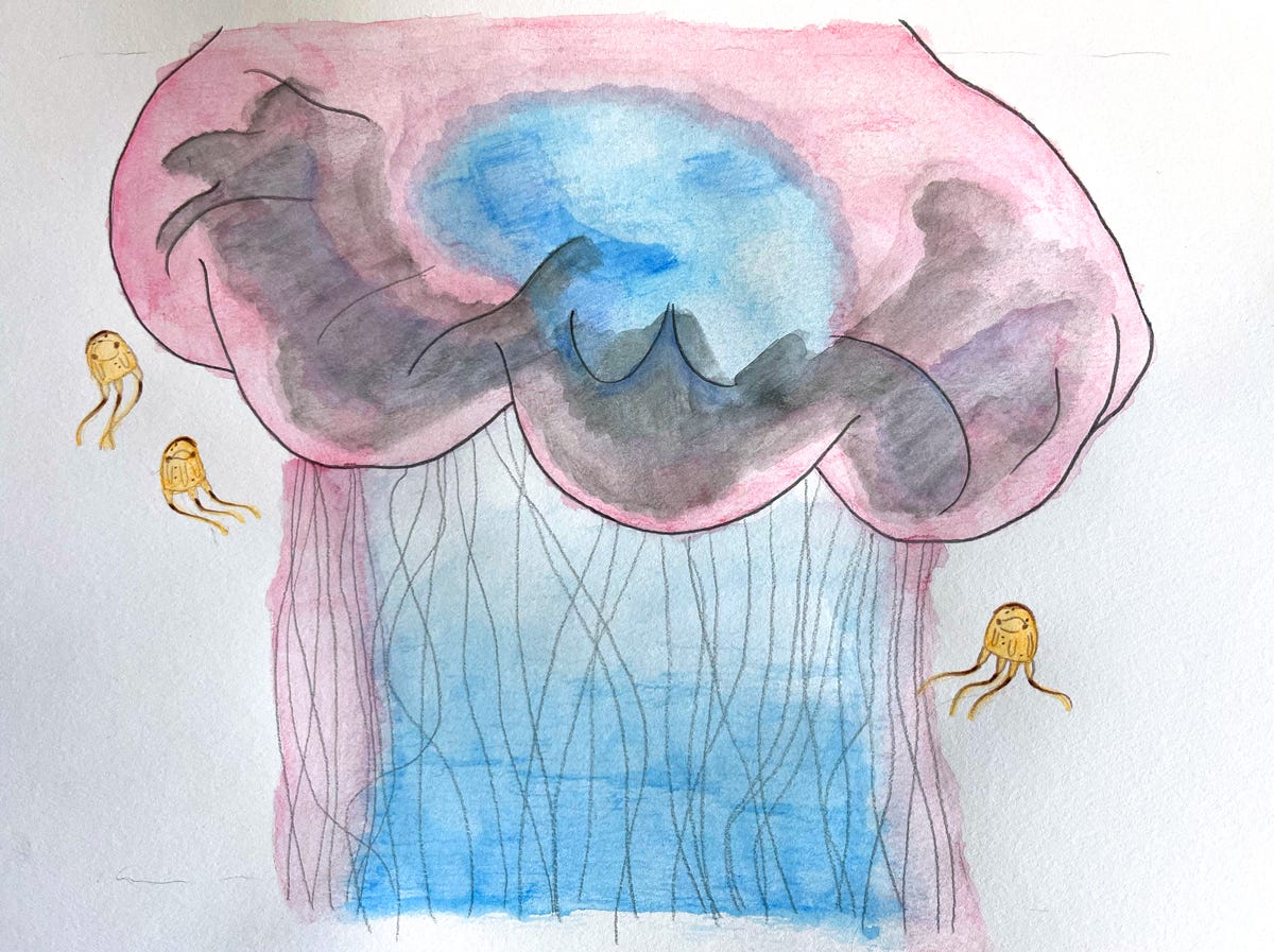
Next I drew in some details and extra color. I drew some details in brown on the little Irukandji jellyfish and painted some black onto the bell of the Lion’s Mane jellyfish. Usually it’s a kinda bad idea to paint or color with black because it has no depth and can be quite flat. But in this case, it’s opposite-town and black will turn to white! So I gave it a try. Lastly, I drew in some black (ie. white) outlines to the jellyfish bell and some light, stringy tentacles (I plan on doing some tentacle work digitally as well).
And now for the exciting part, like in Frankenstein, when you pour in the chemicals or flip that giant electricical switch and finally get to see what kind of odd (grotesque? beautiful?) creation your experimenting has created!
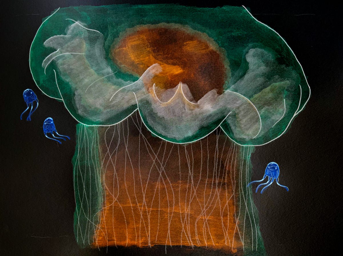
It’s aliiiiiive! Well, it’s not perfect, and it is odd, but that’s why I’m using this whole process. Jellyfish are weird and odd and creepy and beautiful, and I needed a way to create them in that way! Just beautiful doesn’t work. Also, I find just beautiful work boring. Also, I’m not sure I have ever or could make something that could be called beautiful. That’s not really my jam.
What I’m good at—and what I enjoy making—is more creepy-cute. Which is of course, why I’m drawn to fungi and jellyfish and things of that nature. I’m particularly proud of how the Irukandji jellies came out above. Yes!
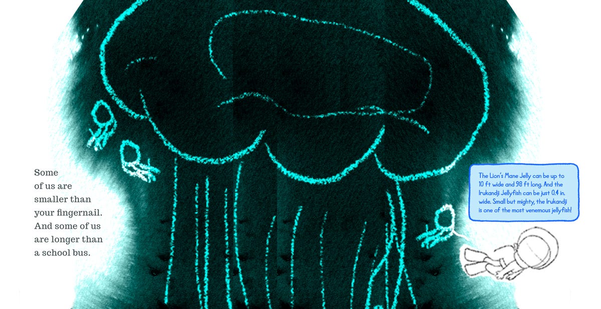
So next, I plopped the painting into my Photoshop file with the background and typography I created before. Looking pretty good! But there’s always a lot of digital tinkering to do.
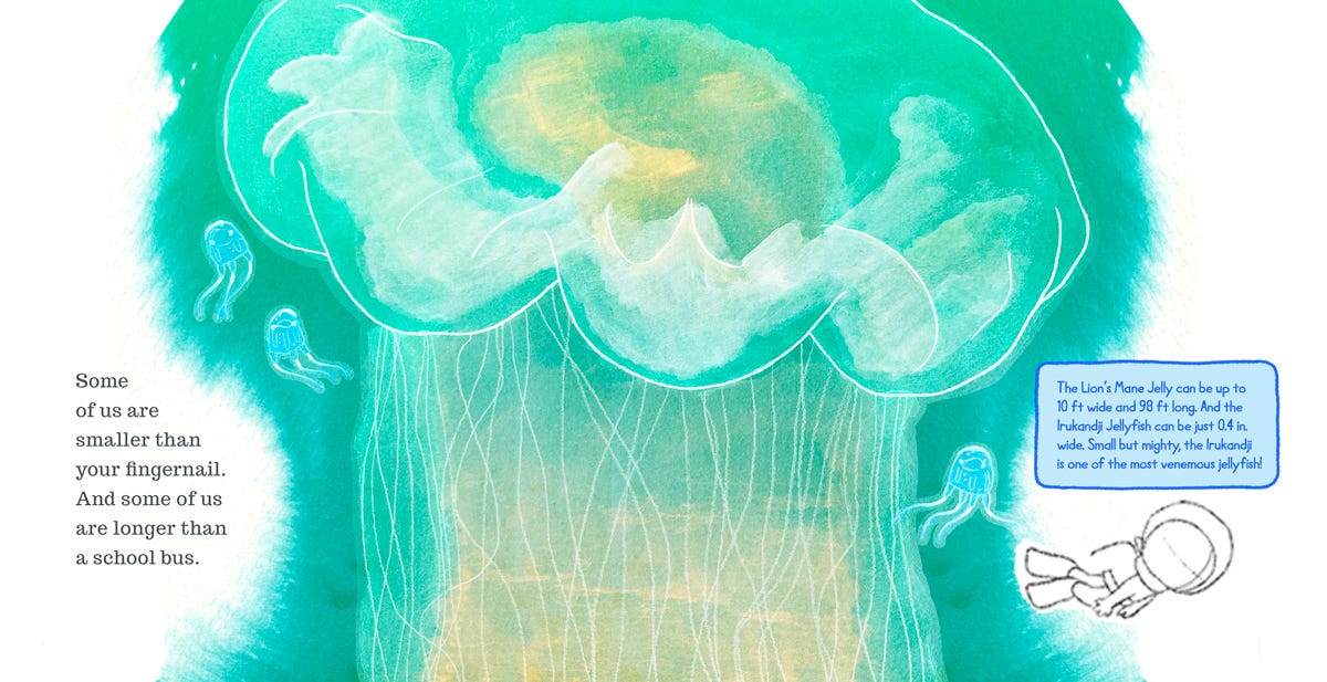
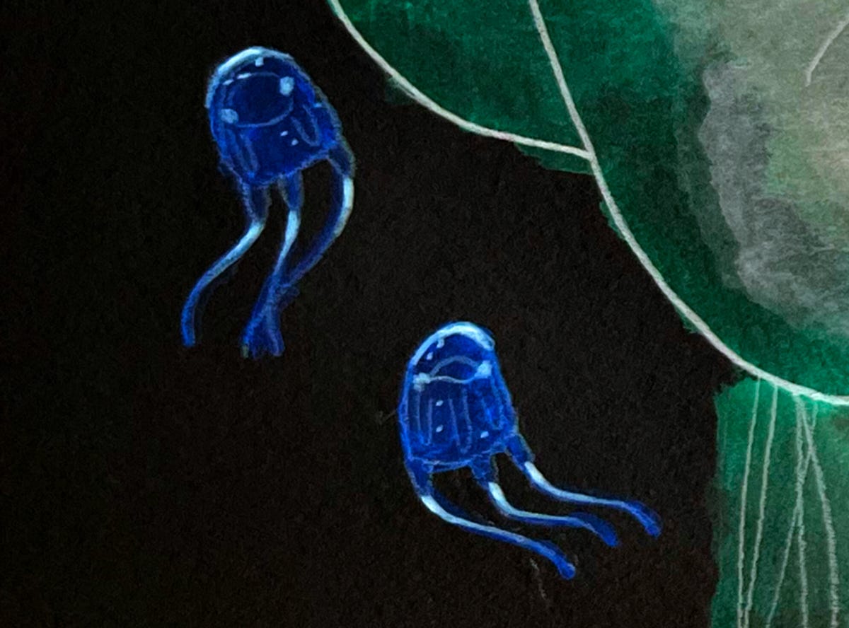
So I started tinkering. I messed with hues, saturation, layer styles, layering, etc, etc.
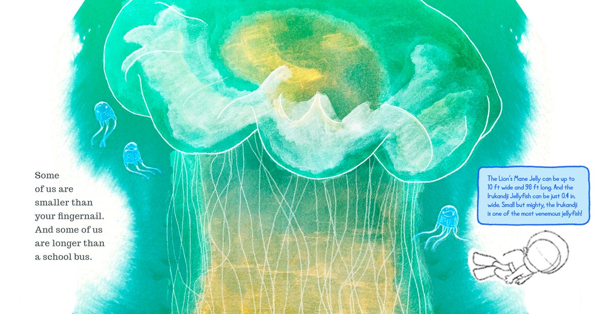
And this is where I stopped for the week! This is still very rough (ie. not final-final) and needs a lot more work. I have plans for the tentacles and I’d like to smudge some colors on the bell and play with the outline to be a little more… something? But I feel like I’m heading in the right direction, and most weeks, that’s all I can really hope for!
Lastly, here’s what the storyboard looks like now with this new Spread 6-7. I also played a little bit with the typography on Spread 30-31, using the design from the half-title (page 1).
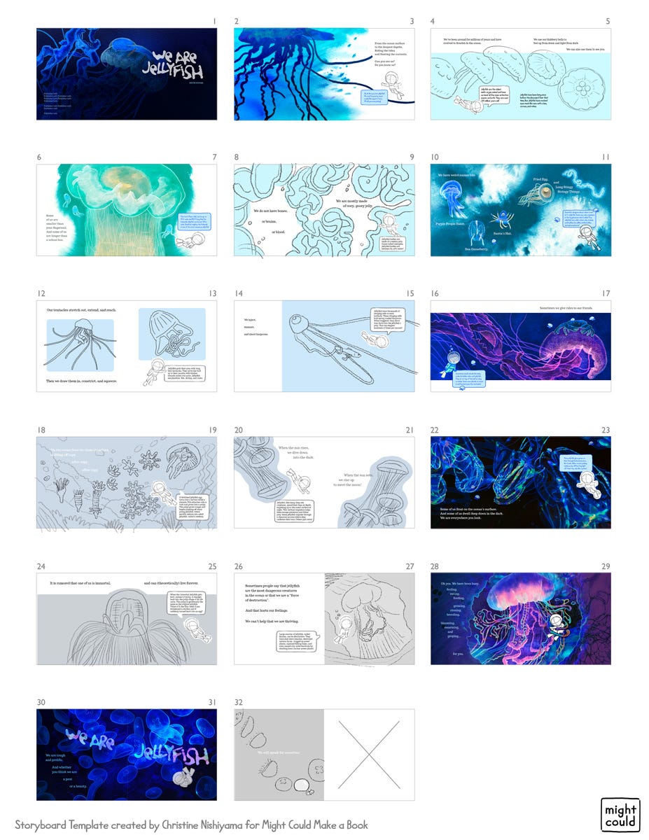
I think it looks pretty nice! Thanks for all your feedback and suggestions on my previous post. I think we’re gettin’ there, y’all!

Welp, that’s it for today! Don’t forget to come draw Off-Brand Pokemon this week with us over on MightCouldDrawToday in the Substack Chat! We’ve already gotten 9 delightfully weird creature submissions. Check them out and share your own with us!
Thanks for reading!
<3,
Christine
Yeah, Christine. Thank you for motivating us to keep pushing on with our art projections. Since, my dad passed I had been in a illustratior block. Your post encouraged me to get back to isketching and painting. Thanks again. kc
It’s going to be a great book! I love seeing the evolution. The process is everything.